
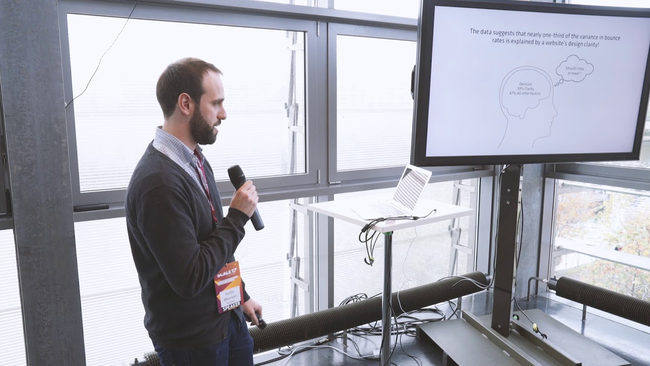
07 Dec Q&A with……Kurtis Morrison, EyeQuant
EyeQuant is a machine learning-based tool that approximates the results of eyetracking and other kinds of user studies, and is a useful part of the Conversion Optimiser’s toolkit.
Originally founded at the University of Osnabrueck (in Germany), the company is now based in Berlin. Binary Bear recently caught up with their Head of Client Services, Kurtis Morrison.

BB- Hi Kurtis. What is EyeQuant and why is it useful in the context of a CRO programme?
Hi Binary Bear! You can think of EyeQuant like spell-check, but for UI. It’s an instantly accessible way to get objective feedback on the design of your live website, or a simple mock-up you’re working on.
For CRO, it’s a great way to quickly evaluate layouts, colour schemes, image choices, and other UI components while developing test hypotheses. It also enables you to pre-screen potential design variants before you commit to running an A/B test, so you can focus your testing resources on the most promising ideas.
BB- We’re reading a lot about how machine learning and AI will be taking marketing jobs. Is it all hype or is there some truth in it?
It’s a difficult question to answer. There certainly are many marketing tasks that could be done better (or more efficiently) by an AI than a person, but technological advancement in marketing isn’t new. Historically, better tech hasn’t meant fewer jobs – just changing job descriptions and different skill requirements.
People hear “artificial intelligence” and imagine Data from Star Trek – something almost indistinguishable from a human, except with more computational power. But today’s AI is more like a really big spreadsheet with a LOT of conditional statements. An incredibly useful tool, but not anything close to replacing the user of the tool.
BB- How important is it to visually gain the user’s attention?
It’s critical. We live in a world of constant distraction. When someone comes to your website, they’re only going to give you a few seconds to convince them to engage further. They’ve got 15 tabs open. They might have 2-3 screens in front of them. They’re bombarded with notifications. You’re lucky if they scroll. You’re lucky if they bother reading more than a couple of sentences. You have to find a way to cut through the noise, and by designing your site to visually emphasize the content that really matters, you’re giving yourself the best possible chance to do that.
As an example, we’ve seen customers increase conversion rates by more than 50% just by improving the visual hierarchy of their landing pages.

BB- How do the clutter score and the excitingness score work? What value do they add to a client’s evaluation of your website?
For both of these metrics, EyeQuant rates a design on a 0-100 scale that helps you measure how a design compares against competitors (with about 90% accuracy compared to empirical ratings from a 200-user study). For example, you can quantify whether or not a design is more “cluttered” than it needs to be. This can be very powerful knowledge, because all of the research we have basically indicates that “cleaning up” a cluttered design is a straightforward way to improve the experience for users, and of course conversion rates too.
The excitingness score is an interesting one because it enables you to choose and test design elements (images, for example) based on the expected emotional reaction that users will have when they see your site.
BB- What do you think are going to be the main trends in the Optimisation industry in the next 12 months?
I was looking through CXL’s “State of Conversion Optimization” survey results from this year, and one of the things that struck me is the huge increase in the number of teams (vs. 2016) that are actually tracking their win rate on tests. I think the next logical step for 2018 is greater emphasis on testing efficiency and ROI, which means more formalized processes and perhaps a hard look at the Optimizer’s toolkit as well. Aside from that, I’m interested to see how GDPR changes things here in Europe in terms of the analytics stack and the methods used to gain user insight.
BB- Is there a cultural difference to the way that users look at a page, can you give any examples?
Generally speaking I’d say yes – culture plays a role in the way anyone experiences a website. That said, our specific research with eye tracking is focused on understanding visual hierarchy, so we’re mainly interested at how people scan the page in the first 3-5 seconds or so after they arrive.
Within that timeframe, behaviour boils down to instinct and we as human beings are much more similar than we are different. Our team hasn’t observed any statistically significant differences in fixation patterns based on where the user is from, although there’s one caveat I can think of: our studies focus mainly on western audiences viewing websites that are written in languages that read from left-to-right, which is probably why we see a bias towards to the top left of the page in the eye tracking results.
No Comments